case study

Wayfound was a course project on designing a wayfinding application for the Claude T. Bissell (BL) Building at the University of Toronto as part of INF 352 Information Design Studio II: How to Design (Professor Olivier St-Cyr).
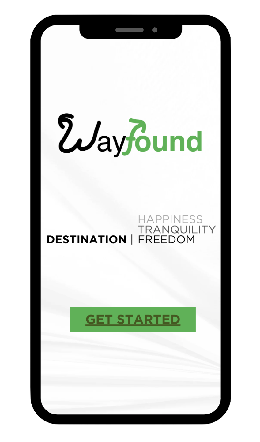
Have you ever gotten lost in the BL building? What was your first day like? Wayfound is designed to help people who visit the BL building navigate to their destinations conveniently.
My Role:
Team: Amie Liu, Alice Miao, Hadi Ahmad, Wanling Ma
Platform: Mobile
Sector: Education (University Building Navigation)
Tools Used: Canva, Miro, Google Workspace
Skills Developed: Interaction Design, Wireframing, Prototyping, Critical Thinking, Problem-Solving, Empathy, Adaptability
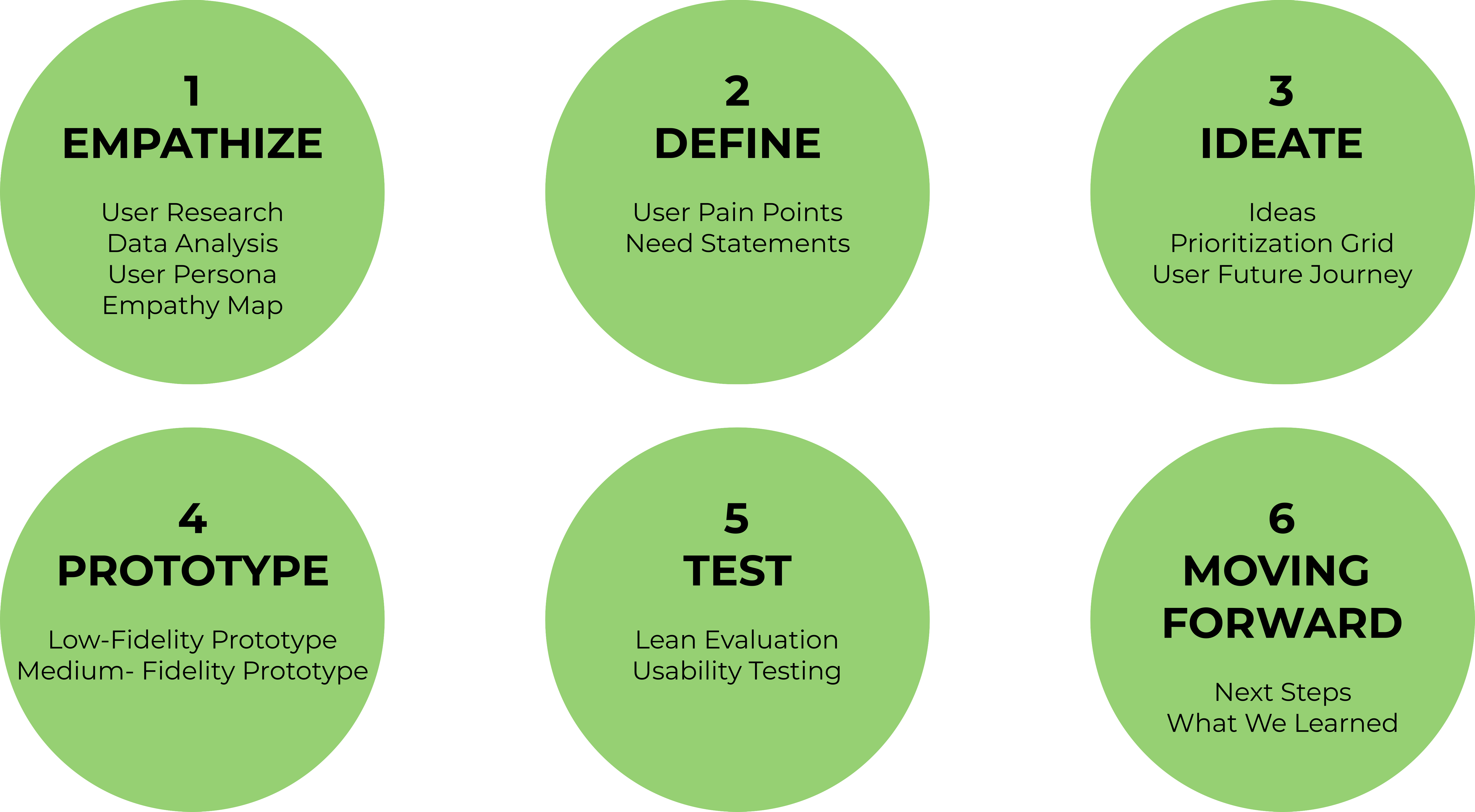
Methodologies: Design Thinking Process, Design Life Cycle, User Research, Lean Evaluation, Wizard of Oz Method, Usability Testing
Our personal experiences reflect the common challenges of finding facilities and the entrance at the BL building's second-floor location. Inadequate signage compounds these difficulties, with unclear directional cues causing inconvenience and requiring extra time to navigate the building.
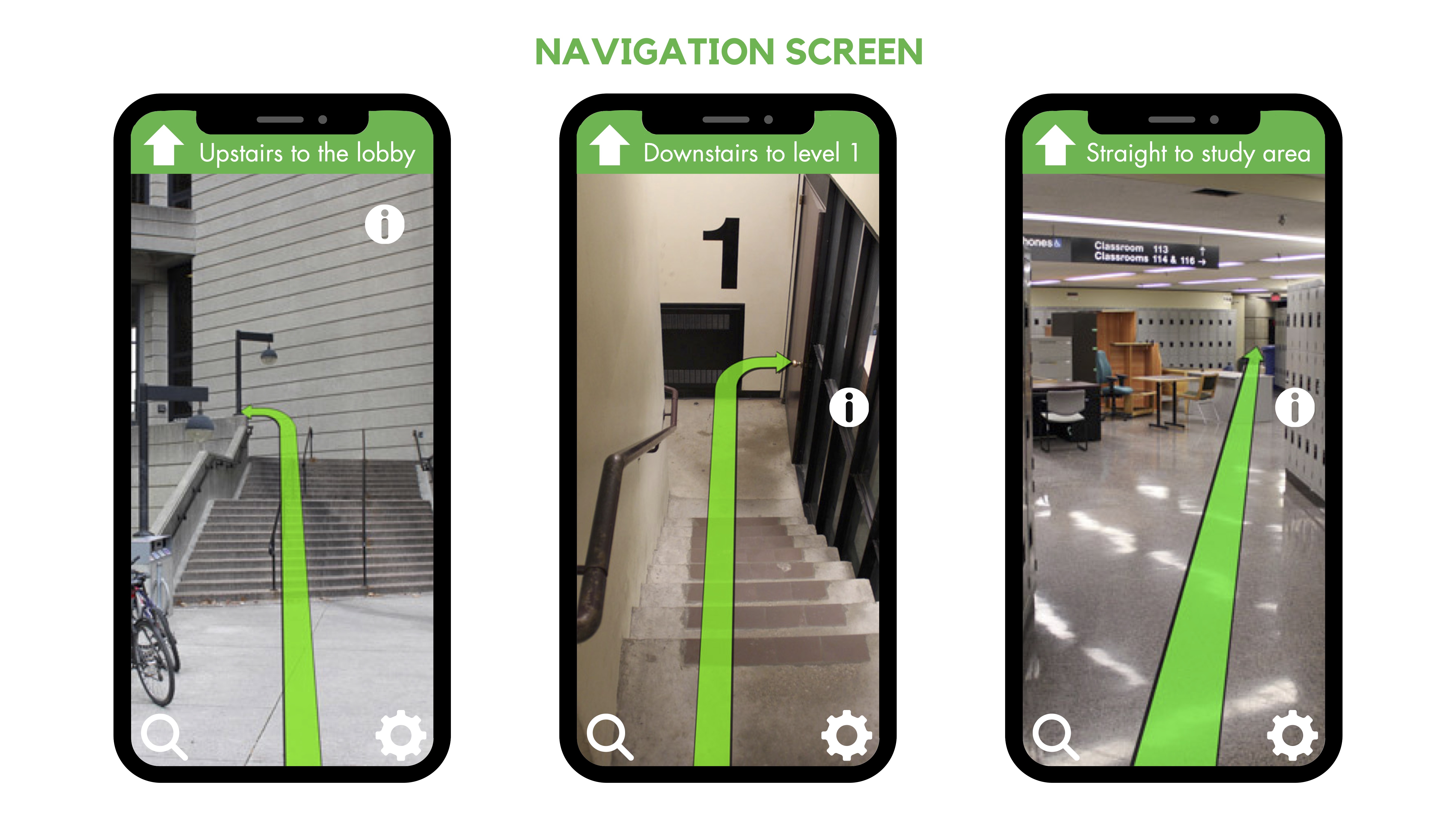
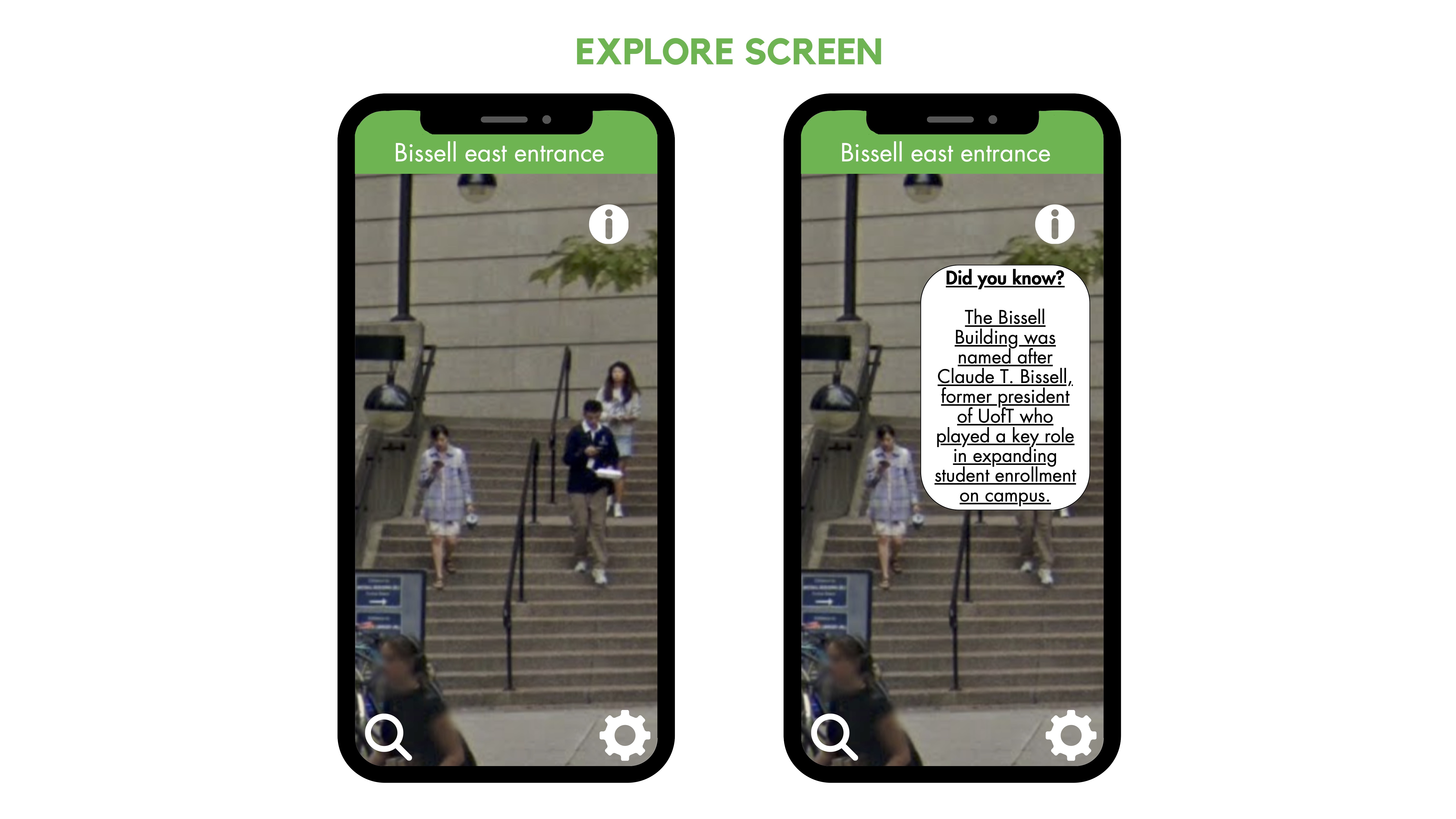
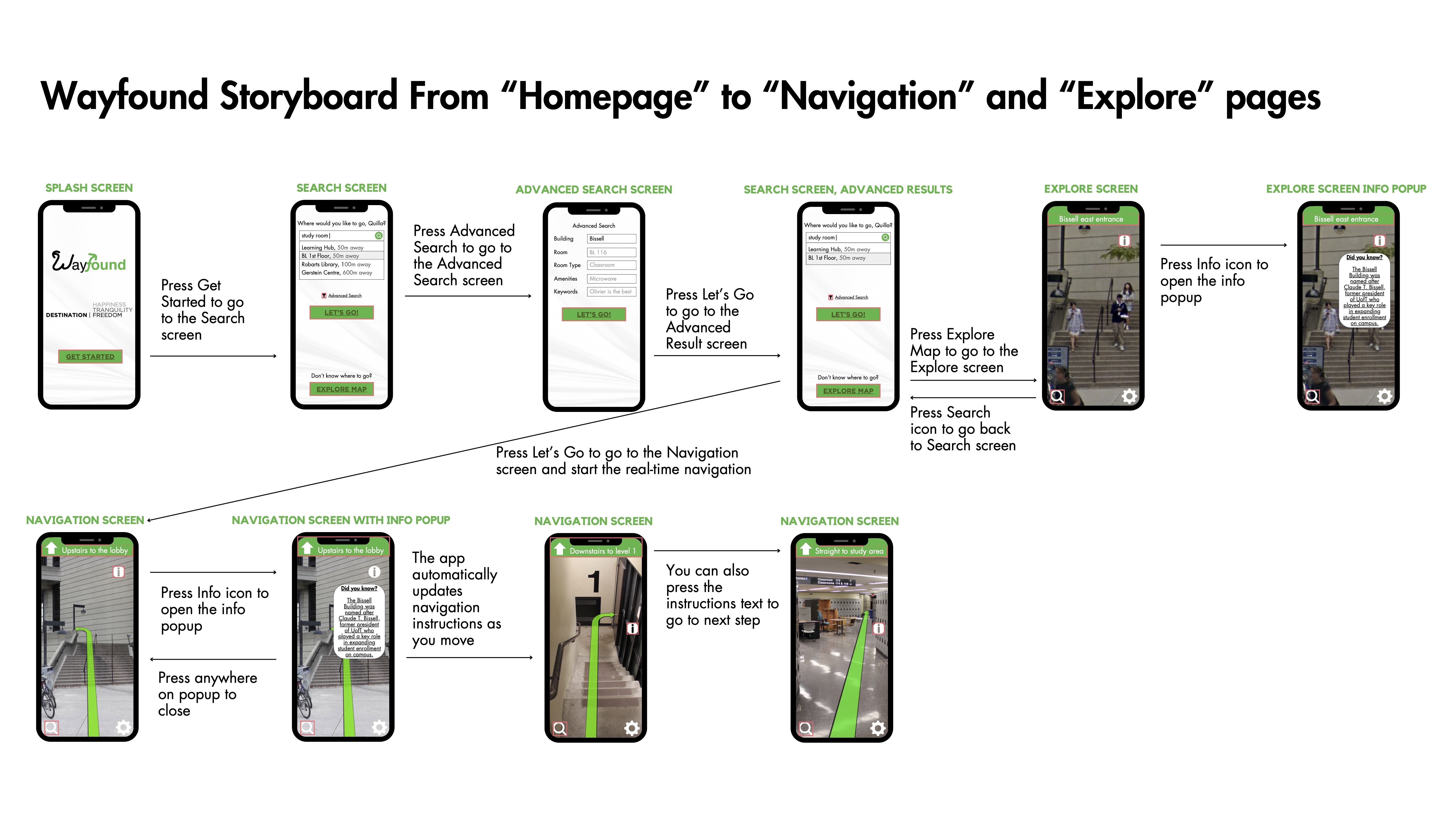
The goal of this project is to develop an app for dynamic and personalized navigation with real-time updates and search functionality, providing portable guidance for increased convenience compared to stationary kiosks or floor plans. The app's visibility remains unaffected during busy periods, reducing congestion.
To formulate our design problem, we examined the impacts of signage used in the real-world design example. In How Design Makes the World by Scott Berkun, designer Paul Mijksenaar used three key principles to guide the design of Amsterdam's Schiphol Airport signage, aiming to make essential information easily accessible (2020):
Similarly, our Wayfound app was going to focus on these principles to provide users with a clear and consistent navigation experience:
Reference: Berkun, S. (2020). How Design Makes the World. Berkun Media LLC.
After conducting the secondary research, we used two data collection techniques, including surveys and interviews, to understand how users interact with the BL building and discover the challenges that the users face when navigating. All data collection took place for two weeks.


We created an affinity diagram to organize the interview responses into meaningful categories: entrance, accessibility, navigation, and facilities. By clustering related information, it becomes evident where the key issues lie and what aspects need attention.
We collected qualitative data on participants' experiences and feelings regarding the BI building.
We gathered quantitative data to record easily. Survey responses were transferred to Google Forms for pie chart visualization and Google Sheets for analysis.
The key findings from the primary research suggested that although users frequently use the BI building, it has shortages in terms of design and navigation. Both the survey and interview results showed the challenges encountered and identified areas that need improvement, including accessibility and signage.
Based on the research, we created a user persona to represent a specific user archetype.
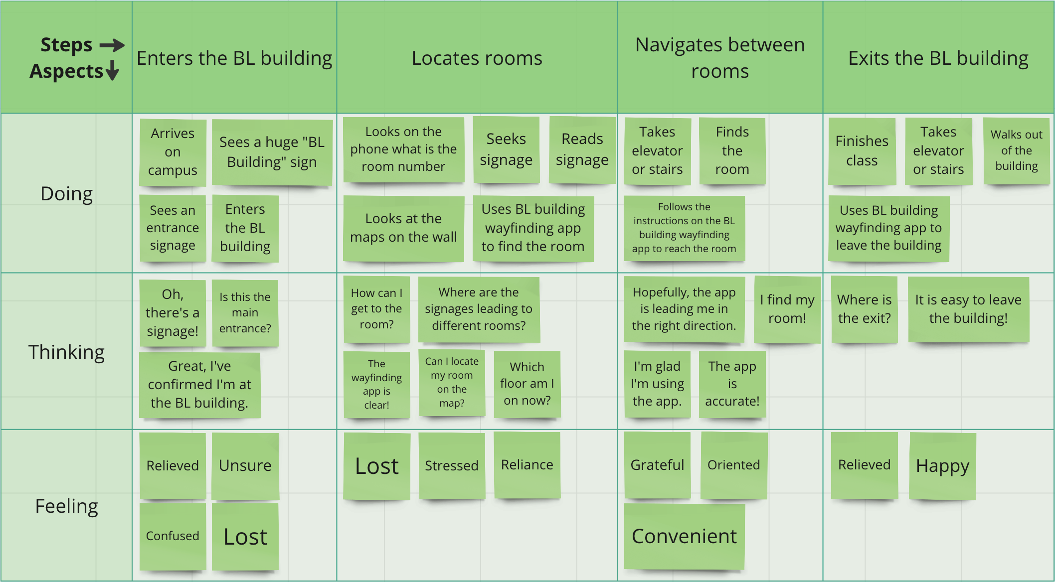
We also created an empathy map to understand and empathize with users.
Through the user persona and empathy map, we identified two user pain points:
We also came up with three need statements to address these pain points:
We focused on user pain points and need statements to ensure that the potential solutions that we came up with were meaningful, user-focused, and aligned with the actual needs and experiences of the target users.
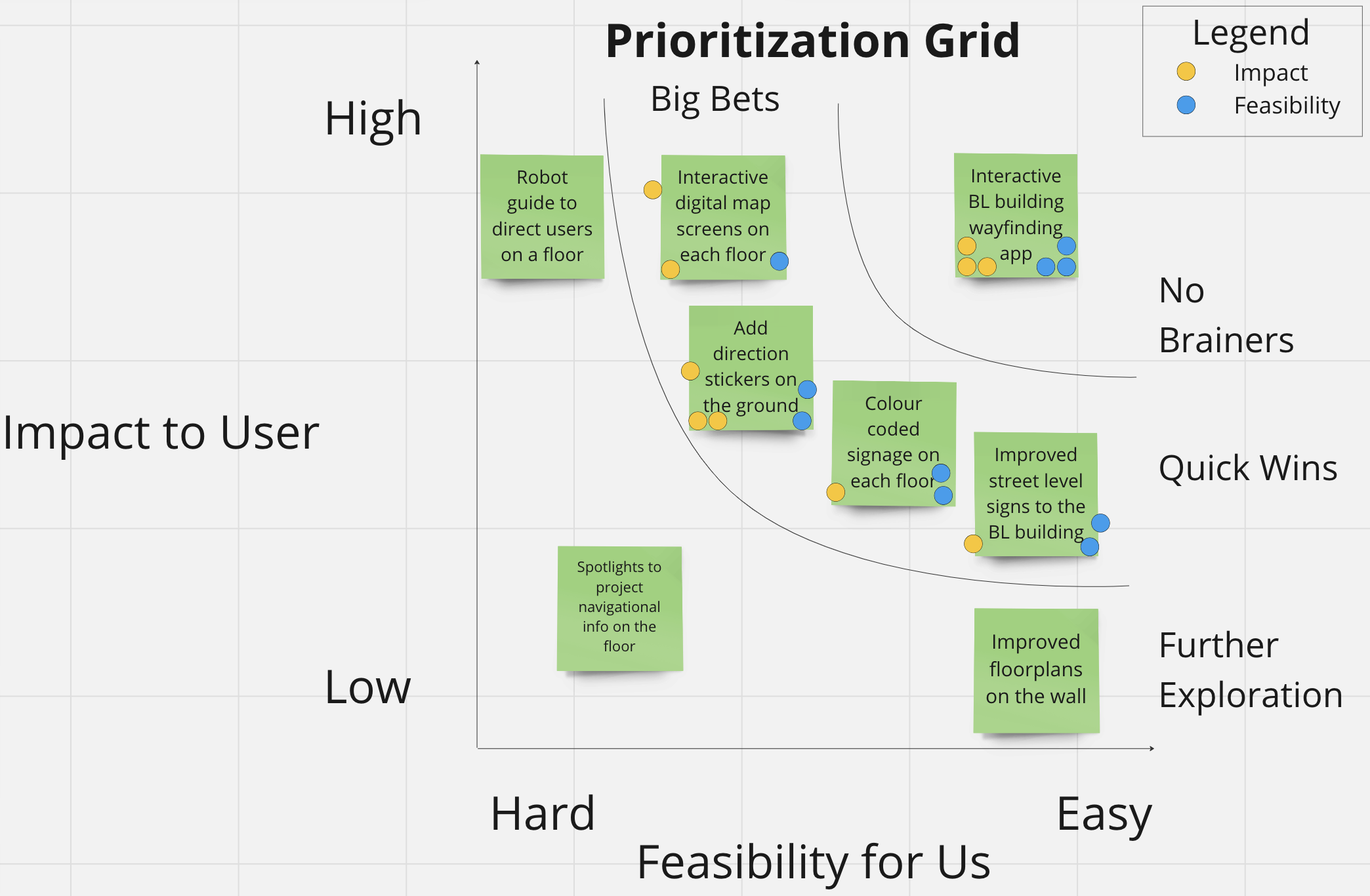
Then, we used a prioritization grid to streamline our decision-making process and prioritize the most impactful and feasible solution that could enhance the user experience in the BL building, and we found the wayfinding app to be a viable solution.
We created a user future journey to envision the ideal state of the user experience. Using the wayfinding app allowed Quilla to easily find the entrance and efficiently navigate the classrooms.
Our initial prototypes were sketches and included four different frames, focusing on three key features: search functionality, navigation, and an interface for exploring the map. These frames form two distinct user flows.
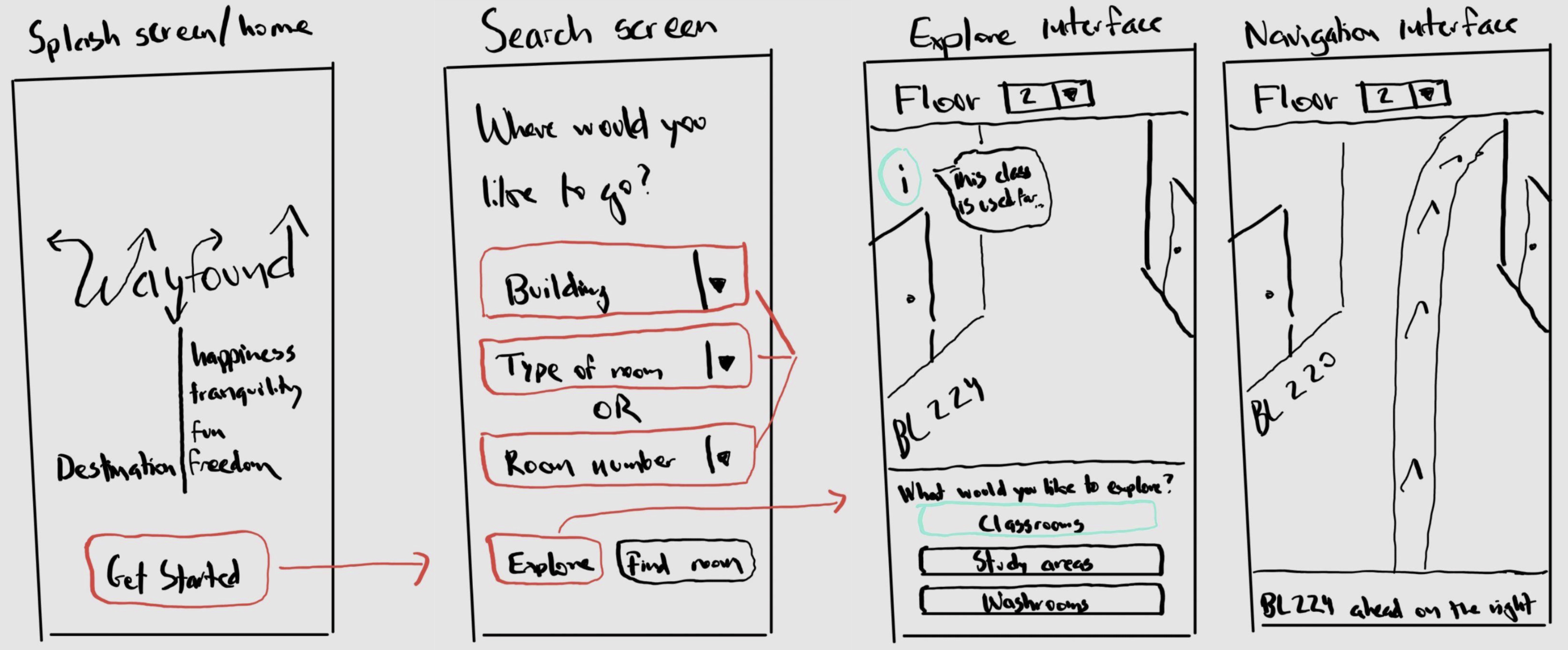
To validate our sketches, two first-year BI students, representatives of the primary user group frequently navigating the BL building, participated in our lean evaluation using the Wizard-of-Oz testing approach. We presented the app's functions and interface to them onsite. By observing their interaction with paper prototypes and making real-time adjustments, we identified usability issues.
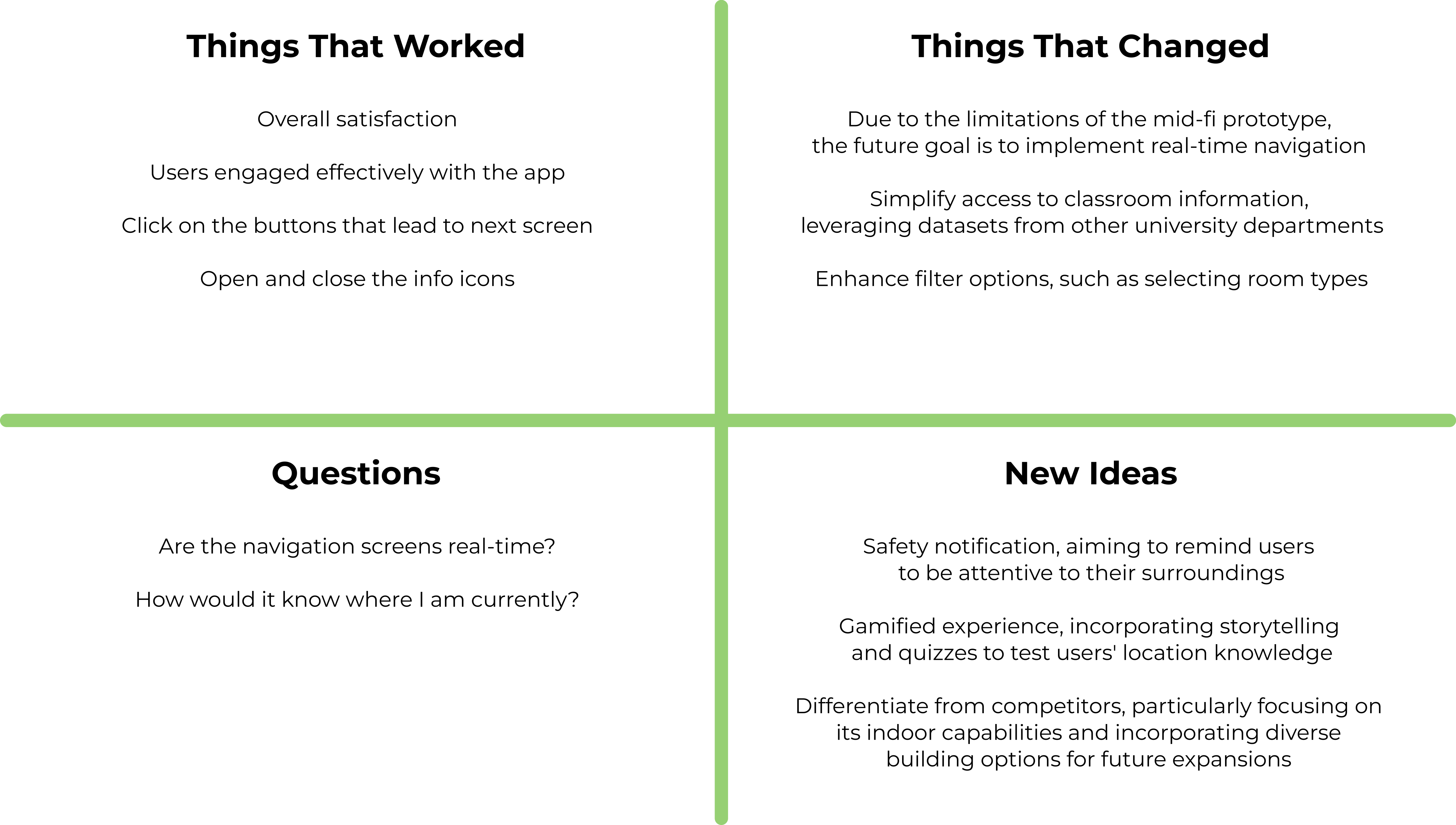
Key findings:
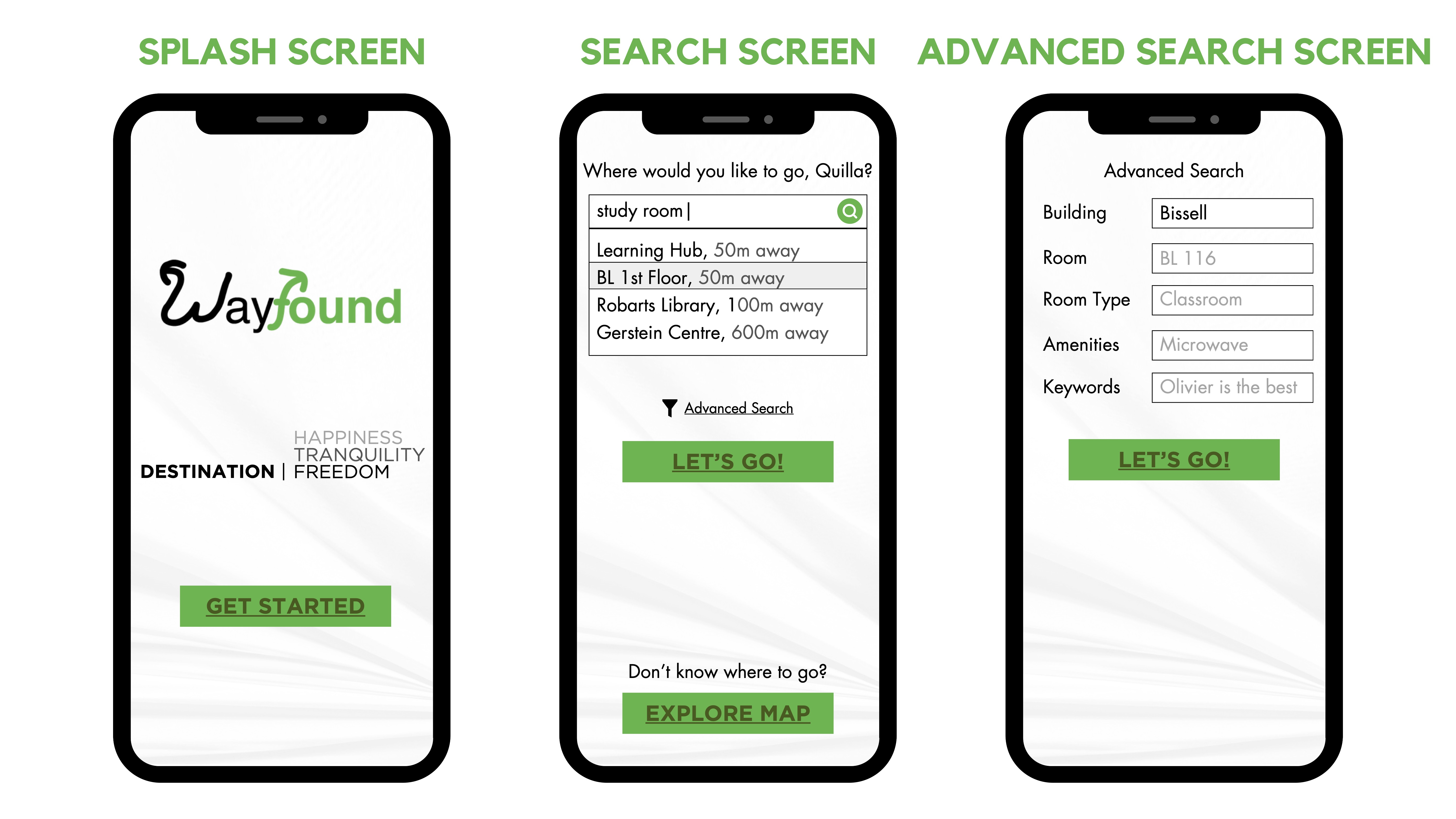
After we learned the evaluation and feedback from the low-fi prototypes, we wireframed the mid-fi prototypes and created a sequential storyboard using Canva. The design should enhance visibility to create a user-friendly interface.
To validate our mid-fidelity prototype, we used a think-aloud protocol and invited five representative users to test our app. While they were performing the test, we observed their actions and verbal thoughts.